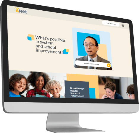
We worked with our partners, who supplied designs for the website development showcasing Achievement Network’s (a nonprofit dedicated to educational equity) large digital case study.
ANet engaged five schools across the United States in a multi-year, multi-level study called the Breakthrough Results Study. It was supported by the Ballmer Group and evaluated by a research team at the University of Southern California (USC).
Services
UI/UX DESIGN
RESPONSIVE
WEB DEVELOPMENT
ANIMATIONS
SEO
ANet & Ginger Journey
One of our partner companies reached out to work with us on developing a website for a new digital case study for their NGO clients, Achievement Network.
As we have extensive experience in developing NGO/Nonprofit websites, we understood that the quality of the end product had to be impeccable and delivered exactly on time for the nonprofit’s marketing campaign.
When we received the designs, they were not fully completed, and the challenge in front of us was that some of the elements still needed to be clarified.
Presentation
ANet Website Development Journey
As always, we started our process by learning as much as possible about the client, their requirements, and goals for the new website. We prepared a sitemap and discussed the website tech stack and deployment options with our partners and their clients.
We decided to develop the website using WordPress. We built a custom block theme for the project, making it extremely easy to modify content. The website was maximally optimized for performance, secure, accessible, and easily extendable.
We incorporated carefully placed animations throughout the website, giving it a fresh and dynamic feel with interactive elements placed in most sections that grab the reader’s attention. These animations had to be carefully tested, and our QA processes ensured that everything worked correctly across all devices and browsers.
During development, our UX/UI designers noticed some elements that could be improved, and we worked with our partners and clients to create the best possible pathways and interface elements that our client’s readers could have.
Responsive Design
Our designers worked with our developers on creating responsive views for the somewhat challenging layouts on multiple pages, and we provided a fantastic experience across all devices.
On mobile devices, for the homepage, we were able to execute the classic horizontal to vertical stack repositioning. Still, for the opportunities page, we had to be more creative.
Instead of tabs on the opportunities page, we created a horizontal pull-in/pull-out layout that kept the website interactive and cool looking while ensuring the content is clearly visible and interface intuitive.
ANet & Ginger Results
How the business is improved
Under a tight deadline, we executed development, helped with design, and went through a couple of revisions of multiple elements until our QA team was satisfied and everything was perfect. We deployed the website and prepared it for production usage by implementing analytics and preparing for SEO. The end result is an excellent digital case study for the nonprofit and delighted partners and clients.
UI/UX DESIGN
RESPONSIVE
WEB DEVELOPMENT
ANIMATIONS
SEO
Our Work
Ready to revolutionize your digital presence and become a case study in success yourself?
Discover the full stories of transformation and innovation with Ginger IT