Introduction
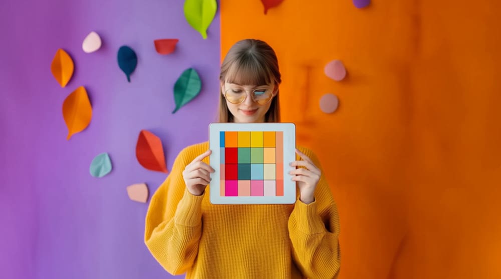
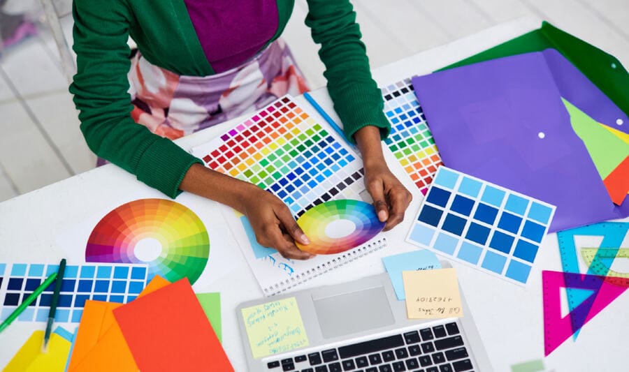
As a graphic designer, I am fully aware of the profound influence colors have on human perception and their role in shaping impressions of attractiveness. A website designed with different color combinations can create entirely distinct impacts on users, even if the change is limited to this single component of the web design process.
But, in the competitive world of web design, colors do more than catch the eye – they shape perception, evoke emotions, and influence user behavior. This process demands meticulous attention and adequate time to plan an effective color strategy for web design projects. It should be handled by an experienced designer with a keen eye for color harmony, aesthetics, and a thorough understanding of UX principles.
Besides that, staying ahead of color trends is essential for creating impactful websites, whether you’re rebranding or building from scratch. So, let’s dive into the most captivating web design colors for 2025 and see how they’re redefining the digital aesthetic.
Table of Contents
Why is Color Selection Important for Web Design?
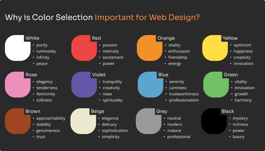
The value of color in web design cannot be emphasized. It sets the tone of a website, improves usability, and encourages conversions. Color psychology research shows that colors may influence emotions and decision-making in a few seconds. For example, blue tones are connected with trust and reliability, making them suitable for businesses such as banking and healthcare. Meanwhile, reds imply passion and urgency, which are frequently employed in e-commerce to encourage rapid action.
Beyond aesthetics, color has a practical purpose in web design by guiding navigation and drawing users’ attention to essential features such as CTA (call-to-action) buttons. CTA buttons should be instantly noticeable and inviting, which is why bold and contrasting colors are crucial for this purpose. Vibrant, attention-grabbing shades of red are often a popular choice for these elements on a webpage. However, red should be used sparingly and intelligently, since too much of it can be overpowering or even unpleasant to consumers.
When used strategically, color enables web designers to create visually stunning websites that build emotional connections and drive specific business objectives. However, when redesigning existing websites, refreshing your color palette should always be guided by data and aligned with market insights.
How Colors Have Emotional Impact on Your Web Design
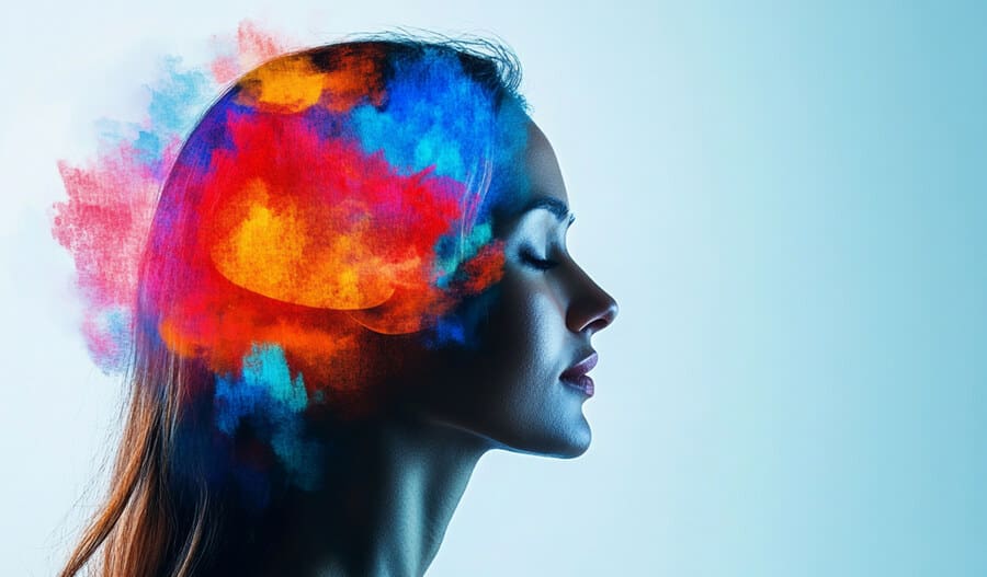
Colors hold profound psychological power, subtly influencing user perception and behavior. In web design, they are pivotal in evoking emotions and steering user actions.
Strategic planning is essential for creating visual harmony and maintaining brand consistency. Begin by establishing the key emotion or message your brand wants to express, and then experiment with color combinations that support these objectives. Think about the psychological influence of each color and how different hues interact.
Blue frequently represents trust and reliability; red, on the other hand, emanates urgency and enthusiasm, whilst green represents development, harmony, and environmentally sensitive principles. Furthermore, pairing vivid and subdued tones may produce startling contrasts and depth, calling the user’s attention to essential parts.
Colors’ emotional influence is not accidental; it is the result of well entrenched cultural and psychological connotations, which designers must carefully examine. Misaligned color schemes may mislead customers and undermine a company’s identity, whereas well-curated palettes improve usability, foster emotional connections, and strengthen brand image.
Color’s ability to impact emotion, behavior, and perception remains a significant element in the designer’s toolkit. Web designers who understand the psychological complexities of color are more likely to craft visually captivating experiences that connect with people and leave lasting memories.
Do Website Color Trends Differ by Industry or Niche?
Absolutely! Web design color palettes are significantly impacted by industry trends and user expectations.
For example, a hospital website frequently uses calming greens and blues to inspire trust and portray a feeling of professionalism, which is crucial for reassuring patients and stakeholders alike. Meanwhile, entertainment platforms commonly use vibrant, contrasting colors to capture consumers and elicit enthusiasm, an approach that complements the dynamic and engaging character of their content. Similarly, eco-friendly firms frequently choose earthy tones such as greens and browns to express their dedication to sustainability and the natural world.
Additionally, colors that convey trust and comfort can significantly boost user engagement and promote longer site visits. This is especially important for websites handling personal information or facilitating financial transactions.
By understanding these industry-specific tendencies, businesses can select color schemes that not only resonate with their target audience but also reinforce their brand identity and align with established norms in their industry.
What Influence Do Web Design Colors Have on Brand Identity?
Selecting a color palette involves much more than choosing shades that look good. It requires aligning your selections with your brand’s personality and core values while maintaining consistency across all platforms.
Brand awareness, a cornerstone of successful marketing, relies heavily on the strategic and consistent use of brand colors. The ability to expertly coordinate colors is essential for creating contrasts, gradients, and combinations that not only attract attention but also accurately represent a brand’s visual identity. Using consistent brand colors throughout a website strengthens the brand’s identity while increasing consumer awareness, promoting trust and familiarity. Consider Coca-Cola’s distinctive brilliant red – this hue is so inextricably linked to the company that it is instantly recognisable globally.
Start by understanding your audience’s demographics and preferences. Are they drawn to muted, sophisticated tones or vibrant, energetic hues? Leverage this insight to craft a harmonious color palette that authentically reflects your brand’s essence. Finally, test your color combinations for accessibility to ensure inclusivity and usability.
By approaching the process thoughtfully, you can establish a cohesive visual identity that not only captivates but also leaves a lasting impression on your audience.
Select the Perfect Web Design Colors for 2025 from Trending Palettes
Looking ahead, here are the top 10 colors expected to dominate web design in 2025, set to become the favorites among designers. To assist you in making a well-informed decision by picking out the most beautiful shades that are in line with forthcoming trends, read on as we explore one of the most fascinating web design colors.
1. Mocha Mousse: Pantone’s 2025 Color of the Year
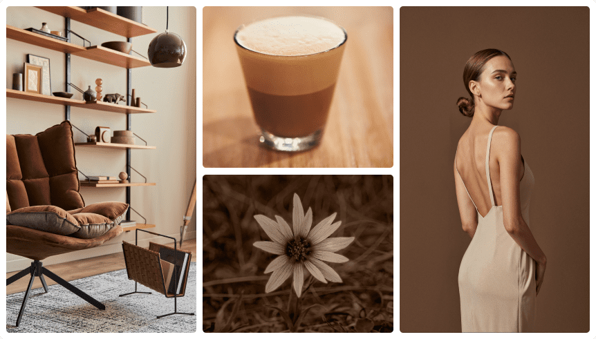
Pantone’s 2025 color of the year, Mocha Mousse, is a luxurious, warm brown that combines indulgence with approachability. This versatile shade works beautifully as a background color, bringing depth and warmth to minimalist designs. It may also be used with more vibrant colors such as rum raisin (muted red-brown hue) or verdant green to create eye-catching accents that highlight essential design features.
Mocha Mousse is especially successful for businesses seeking to express stability and sophistication, making it popular in areas such as finance, luxury retail, and hospitality. Its neutral yet inviting tone blends well with both modern and traditional designs, allowing designers to craft visually appealing interfaces that resonate across diverse audiences. Whether used sparingly or as a prominent motif, Mocha Mousse truly has a timeless appeal.
2. Sunny Yellow: Radiating Optimism and Warmth
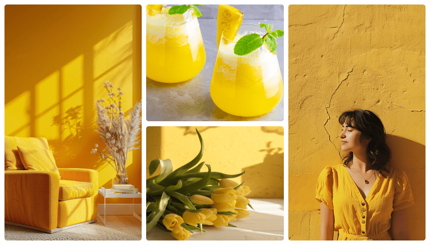
Radiating optimism and energy, sunny yellow is making waves in 2025 web design trends. It’s ideal for accents and highlights since it draws attention without overpowering the overall aesthetic.
In the education industry, sunny yellow symbolizes creativity and innovation, making it a popular choice for e-learning platforms and academic websites. In technology, it may give otherwise clean and futuristic designs a more pleasant and approachable vibe, therefore humanizing sophisticated interfaces. Meanwhile, hospitality brands utilize this shade of yellow to evoke warmth and friendliness, which is ideal for drawing attention to promotions or key features like booking buttons.
This versatile color creates a mix between brightness and refinement, making it appropriate for a variety of sectors looking to make a favorable and lasting impact on their consumers.
3. Ethereal Blues: Serenity all the Way
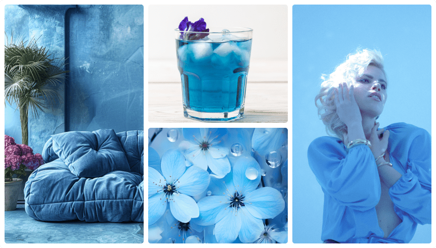
Soft, calming blues are a staple for 2025, offering serenity and trustworthiness that appeal to a broad range of industries.
Ethereal blues are perfect for spa websites or mindfulness apps because of their calming and reassuring effects in the wellness industry. In the IT industry, these specters of colors help establish a modern and user-friendly aesthetic, often appearing in dashboards or app interfaces to enhance readability and navigation. They work seamlessly for creating gradients, lending depth and dynamism to designs that would otherwise be flat.
A look that appeals to those looking for practicality and flair is achieved when ethereal blues are paired with neutral tones such as moonlight greys. Their versatility allows them to seamlessly blend into many surroundings, whether it’s promoting professionalism on business sites or creating an atmosphere of calmness on health-focused platforms.
4. Moonlit Greys: Refinement With a Futuristic Twist
Moonlit greys offer a neutral base with a futuristic twist, making them a versatile choice for modern web design. These shades pair exceptionally well with bold accent colors like maroon or vibrant blues, creating striking contrasts that draw the viewer’s attention to key elements. Alternatively, combining moonlight greys with delicate pastels, such as muted rose or digital lavender, lends elegance and refinement to the entire look.
This adaptability makes moonlit greys particularly effective for tech websites, where sleek sophistication is paramount, as well as creative portfolios that want to emphasize creativity without dominating the content. Designers may add depth and character to moonlight greys by layering them with textures or gradients, increasing visual appeal while keeping a clean, professional appearance. Their subtle yet dramatic presence guarantees that they are a timeless option.
5. Glossy Black: Mystery That Radiates Richness
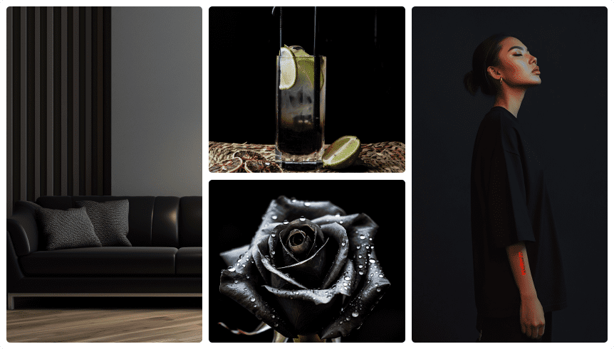
Glossy black radiates richness and depth, making it an excellent choice for high-end websites, particularly for businesses in fashion, automotive, and luxury goods industries. Its reflecting quality adds complexity and mystery, resulting in a strong visual effect when used for backdrops, typography, or product displays.
Glossy black may be used as a dramatic yet stylish backdrop in minimalist designs, allowing crucial features to stand out clearly. It adds drama and grandeur to maximalist settings, working well with metallic elements such as gold or silver. Psychologically, black symbolizes power, elegance, and exclusivity, which appeals to consumers wanting premium experiences.
This versatile color also works well in digital interfaces, where the clean finish adds modernity and attention. Designers may create visually appealing websites that speak to people that value refinement and elegance by deliberately employing glossy black.
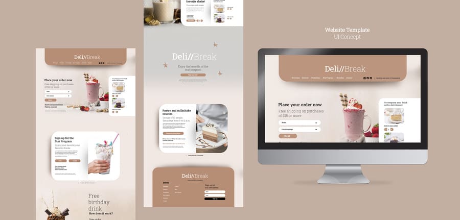
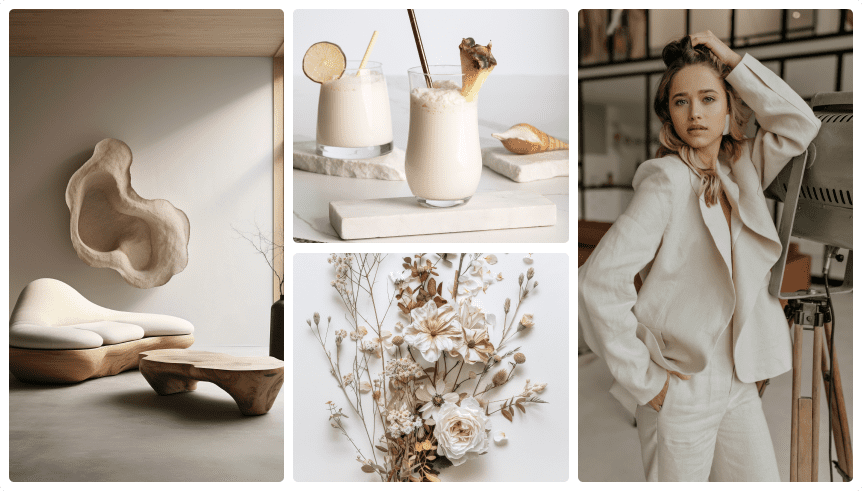
6. Bisque: Creamy Beige with a Delicate Pink Undertone
This soft neutral tone exudes elegance and delicacy, making it an excellent choice for creating refined, minimalist web designs.
Bisque is ideal for fashion brands because it creates a classy backdrop that allows items and pictures to stand out without overpowering the viewer. This colour encourages tranquility and relaxation in the health and beauty industries, creating trust and a peaceful customer experience. E-commerce sites typically use bisque beige to showcase product photographs, making sure it compliments rather than conflicts with the advertised products. Portfolio websites benefit from the clean and polished look, which creates a coherent canvas that highlights the creator’s work.
The versatility and timeless appeal of bisque make it a preferred choice for brands striving to balance modernity with understated luxury.
7. Verdant Green: Symbol of Regenerating Vitality

Verdant green, with its vibrant and rejuvenating energy, symbolizes growth and harmony.
Businesses that prioritize sustainability and the agricultural sector benefit greatly from this shade since it accentuates natural elements and the concept of rebirth. Brands that care about the environment typically utilize it in logos, marketing materials, and website accents to indicate how serious they are about environmental protection. Startups and firms creating green technology often use verdant green as a brand color since it represents innovation and growth in the tech field.
For an aesthetic that is both balanced and invigorating, try pairing verdant green with complementing tones like soft neutrals or bold blues. This will appeal to audiences seeking authenticity and forward-thinking solutions.
Its adaptability makes it a powerful choice for a wide range of web design contexts, whether as the main color or a subtle accent.
8. Rich Reds: Rum Raisin and Maroon to Inspire Passion
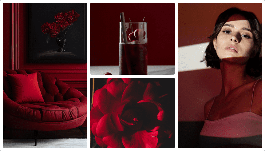
Deep reds like rum raisin and maroon evoke passion and sophistication, making them a powerful choice across various industries.
In luxury retail, these tones are frequently utilized to generate a feeling of exclusivity and high-end appeal, making them ideal for highlighting expensive items or accentuating critical calls-to-action. Culinary companies commonly use rich reds to represent flavor, indulgence, and warmth, focusing attention on crucial graphics such as logos or advertising banners. Furthermore, these tones work well in the entertainment business, where they may lend drama and intensity to digital platforms or advertising materials.
Whether used in typography, accent elements, or product highlights, rich reds create a stunning yet beautiful contrast that captivates consumers and creates a lasting impact.
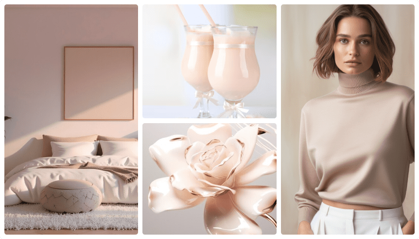
9. Muted Rose: Soft, Classy Blend of Pink and Beige
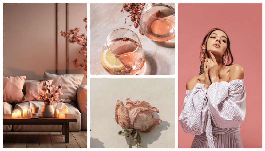
Muted rose blends the warmth of pink with the neutrality of beige, creating an elegant and timeless appearance that appeals to a variety of sectors.
High-end fashion brands often use muted rose to evoke elegance and softness in digital campaigns,blending it with neutral tones to emphasize product details without overpowering the design. Similarly, boutique hotels use this color in their web presence to communicate a sense of refinement and comfort, which is consistent with their clients’ aesthetic standards. In interior design and home décor e-commerce platforms, muted rose is a flexible backdrop that improves product photography while retaining a consistent visual identity.
Its balanced nature makes it ideal for creating inviting and luxurious experiences across digital platforms that leave an indelible impression on users.
10. Digital Lavender: Creativity Meets Tranquility
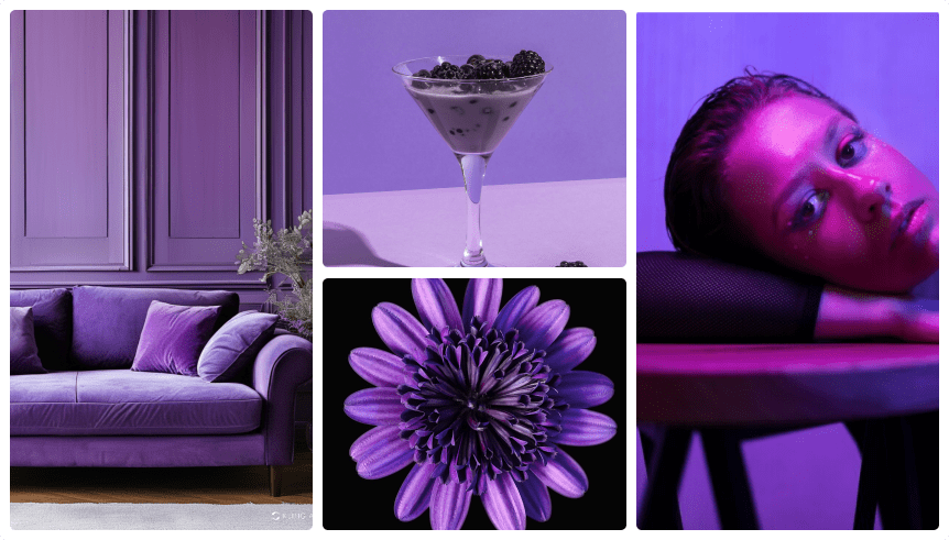
Digital lavender is a soothing yet modern shade that bridges creativity and tranquility.
Its adaptability makes it appropriate for digital companies, creative agencies, and health businesses alike, as it provides a new spin on conventional pastels. This hue is particularly effective in app interfaces, where its relaxing but bright nature improves user experience and lowers visual fatigue. This color is commonly utilized by wellness firms to create a relaxing and welcoming environment, making it a great option for meditation applications.
Creative companies frequently use digital lavender in marketing materials to express innovation and creative flare, either as a backdrop for typography or layered inside gradients. It’s no surprise that Ginger IT Solutions has employed this color in its branding elements as well.
Designers may create a distinct and modern aesthetic by blending digital lavender with complementing hues such as soft greys or subdued greens.
How to Combine Web Design Colors for your Next Project

Let’s clear one thing up – there’s no definitive right or wrong when it comes to color combinations in web design. Whether it’s bold contrasts and vibrant gradients or soft, sophisticated neutrals that are easy on the eyes, the goal is to implement color pairings that breathe life into your creative projects and tell a compelling story about your brand. Sometimes the greatest technique is to use bold, eye-catching hues, while other times a harmonized palette of varied tones of a single delicate hue produces the most striking effect.
Keep in mind that a well-designed website typically incorporates 3 to 5 core colors: a primary color, secondary accents, and neutrals for balance. Too many colors can overwhelm consumers and cause visual chaos, while too few might result in a dull and unappealing design.
Web designers should feel to express their creativity and experiment with color combinations to create visually appealing and highly effective designs. Success often hinges on finding the perfect balance that reflects your brand’s essence while resonating with your audience.
Two key principles shape color combinations in web design: bold contrasts that command attention and subtle, refined blends that reflect sophistication and elegance.
1. Bold Contrasts and Vibrant Gradients: Making an Impact
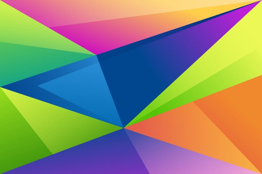
Bold contrasts and colorful gradients are reshaping current web design, resulting in dynamic images that engage viewers and increase brand visibility. These design aspects are especially effective in areas like gaming, fashion, and entertainment, where eye-catching aesthetics are essential for user engagement.
In gaming, colorful gradients provide an active and engaging environment, emphasizing the platform’s dynamic nature. Similarly, fashion websites frequently employ strong hue contrasts to showcase seasonal collections and create a dynamic, contemporary aesthetic. Entertainment platforms use these aspects to generate interest and bring attention to highlighted material, such as movie trailers or event marketing.
By combining complementing hues or experimenting with unexpected transitions, web designers may push creative boundaries and assure project memorability, making these trends essential for visually forward-thinking enterprises.
2. Muted Tones and Subtle Neutrals: Digital Sophistication
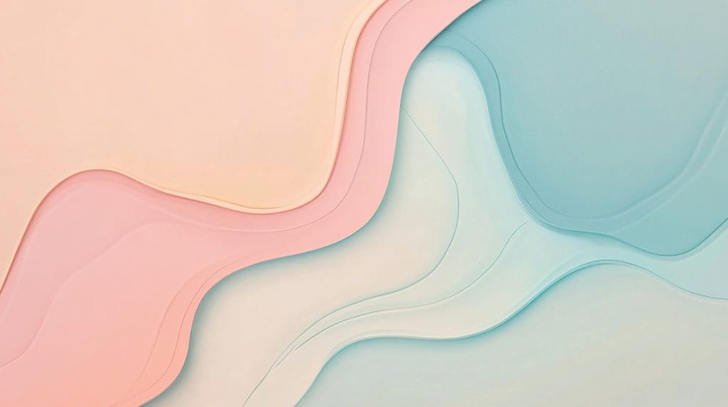
Muted tones and subtle neutrals are becoming popular for their ability to portray professionalism and peace. These hues are perfect for corporate websites, as they convey a trustworthy and authoritative image without overpowering the reader.
In the financial business, subdued tones are frequently employed to convey stability and dependability. Educational platforms use similar colors to create a distraction-free learning environment. In healthcare, gentle neutrals assist to create a peaceful and accessible style, boosting user trust and comfort.
Designers can strike a balance between visual appeal and functionality by blending subdued tones with carefully selected accent colors.
Harnessing AI Design Tools to Perfect Web Design Colors
Yes, colors evoke emotions, but their functional role in web design is equally important. That’s why it is essential to leverage AI and other design tools throughout this creative process.
AI design tools such as ChatGPT and MidJourney are transforming how designers choose colors. The debate is no longer whether they should be utilized, but rather how to use them successfully to create visually appealing and user-friendly websites, all while customizing the approach to the specific requirements of each web design project.
Web designers may remain ahead of the curve by using these modern technologies to create visually attractive experiences that appeal to a wide range of users. Why are their applications so desirable? AI Design systems monitor user behavior and aesthetic trends to provide palettes that are consistent with company goals, speeding the design process while maintaining precision. For example, MidJourney’s ability to produce unique visual ideas based on text prompts enables designers to experiment with unconventional color combinations targeted to certain sectors. Similarly, ChatGPT helps to curate mood boards by providing insights about popular colors and their uses.
Furthermore, tools like contrast checkers ensure designs remain inclusive while maintaining aesthetic appeal. For instance, the WCAG Contrast Checker helps designers verify compliance with accessibility standards, ensuring legibility for users with visual impairments. In addition, platforms like Adobe XD or Sketch allow for real-time testing of color combinations, enabling teams to assess both the emotional and functional impact of their choices.
By blending these intuitive tools with thoughtful strategy, web designers can create experiences that are both visually captivating and functionally seamless.
Future UX design will highlight individualized color schemes that smoothly adapt to user settings and preferences, resulting in a more bespoke and immersive experience. As technology progresses, interfaces will become more customizable, including layout modifications and personalized color schemes. This method strives to strengthen the bond between users and the brand, increasing engagement and loyalty.
Wrapping Up
So, now you have it! Web design colors for 2025 are setting a bold yet balanced tone, reflecting a world that craves both vibrancy and elegance. From Mocha Mousse to Digital Lavender, these trends offer endless possibilities for brands to differentiate themselves.
Strategically incorporating these colors while achieving the perfect balance between emotional impact and functionality can significantly enhance user experience and strengthen brand identity. Now is the perfect time to refresh your color palette and align it with the latest trends. Feel free to draw inspiration from these ideas to enhance your next web design projects. Collaborating with our web design agency can offer the expertise required to seamlessly incorporate current color trends into your website, resulting in a polished and contemporary aesthetic. Partnering with professionals ensures your strategy remains innovative and ahead of the curve.